COVID-19 Modeling
Introduction
Starting in late April, as the COVID-19 pandemic swept across the United States, several news stories and articles were published highlighting a racial bias in COVID-19 infections and deaths. These articles were followed by counterpoints suggesting that the racial discrepancy in COVID-19 infections was not surprising and could be explained by differences in socio-economic status and access to health care, which are divided along racial lines. Curious to see what the consensus was regarding the underlying cause of the discrepancy was, I looked for more resources. I struggled to find a paper or other analysis that considered a variety of demographic and socio-economic covariates when assessing the importance of race on COVID-19 infections.
This project is my contribution to determine the relative importance of a variety of demographic and socio-economic factors on COVID-19 mortality rates. The aim of this project is to build a regression model to predict the number of deaths because of COVID-19 the next day. The regression coefficients of this model will show the relative influence of different demographic variables. I’ll build up to an ultimate model through a series of blog posts.
Data
Related blog post: COVID-19 Data Cleaning
I start by gathering data from a variety of sources and compiling and cleaning the data to create tidy datasets. At its heart, this project is an adventure in data fusion, and the diversity of sources and types of data requires a hefty amount of cleaning.
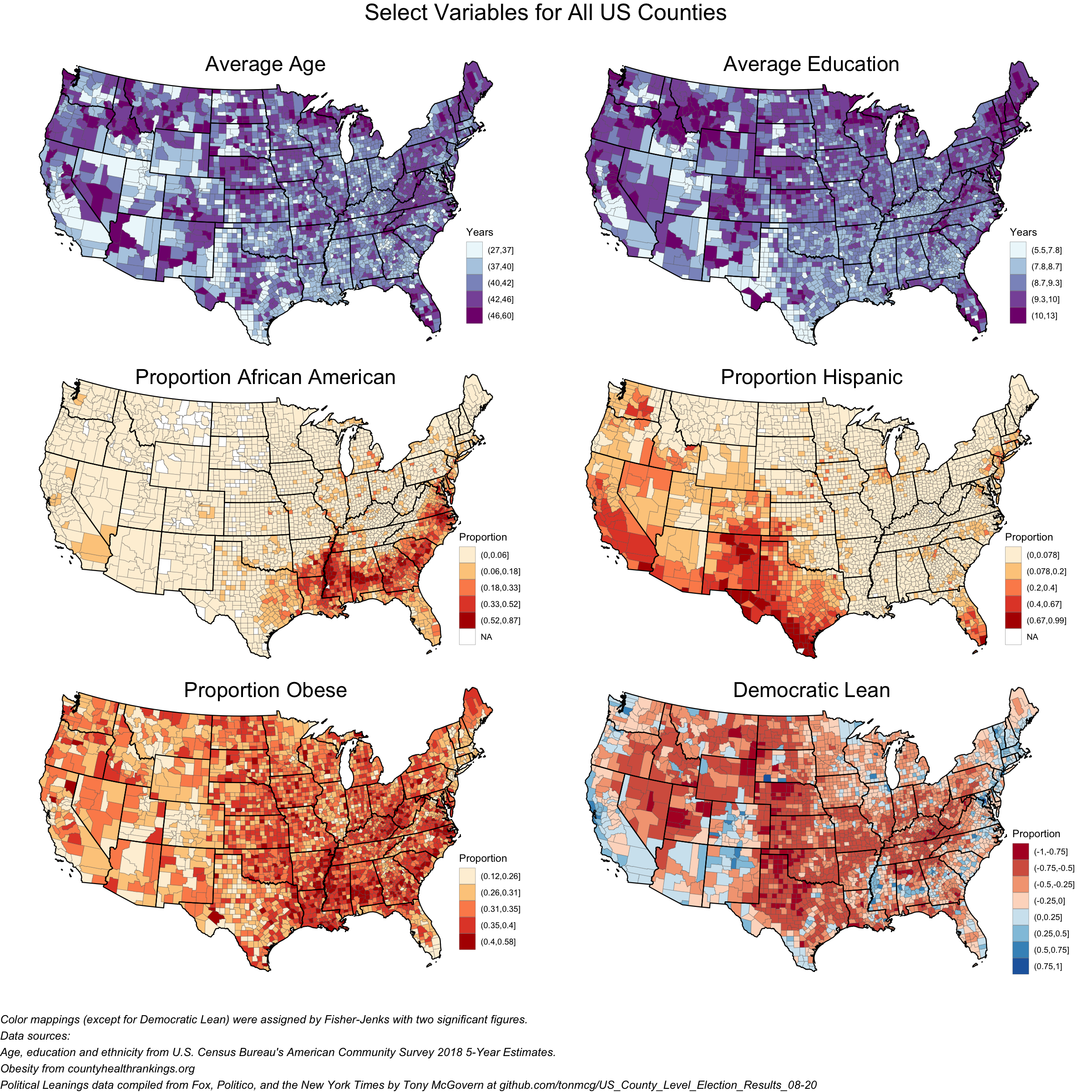
The first type of data I will look at is geospatially distributed data. This data is demographic data from the Census Bureau, health and co-morbidity data from County Health Rankings, and political affiliation data from the 2020 presidential election. These data sets describe the underlying characteristics of each US county along several axes. Critically to my mission of understanding how race affects COVID-19 mortality, the demographic data contains comprehensive information on race and ethnicity. The chloropleths below give a visual overview of several of the geospatial datasets.
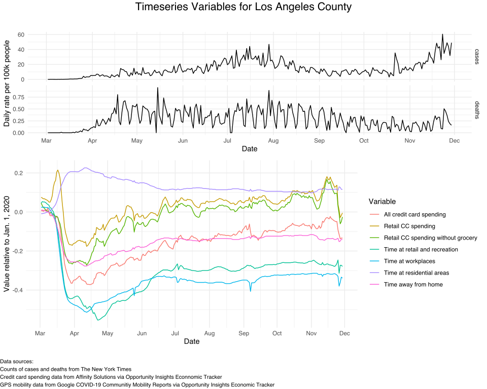
Beyond the geospatial data, I will also look at temporal data for each county and state in the US. I will look at COVID-19 spread data from the New York Times (NYT) as well as economic and mobility data from Opportunity Insights. I show these datasets below for Los Angeles County.
Timeseries Modeling
Related blog post: Poisson Timeseries Models
The goal of this project is to model the number of COVID-19 deaths in each county. This dataset is two-dimensional: one dimension is temporal, the other is spatial. In order to stay honest to the data, I will model along both dimensions of the data. First, I will build a timeseries model that predicts the number of deaths per day in a county. I then expand this model into a hierarchical model so that even counties with few deaths over the past nine months will have accurate parameter estimation.
In this blog post, I set out to build a timeseries model for COVID-19 deaths in US counties. I started simple with a basic autoregressive model, and upon discovering the limitation of that model, moved to subsequently more complex models tailored to the specific application. The result is a robust model that uses a limited set of data to explain the variation in COVID-19 deaths within a county.
I started off with a seasonal autoregressive model with a normal error model. This is a standard model that can be found in any statistical or timeseries analysis package. The normal error model didn’t work with the count-of-deaths data - the credible interval extended into the negatives, which is not possible. The normal model also assumes heteroskedastic errors, which is not the case, and had far too large of a credible interval early in the timeseries, when there were consistently zero deaths.
The next model swapped the normal error model for a Poisson error model to better fit the positive integer data. This prevented the credible interval from going into a negative number, fixing one problem, but over corrected for the second problem, giving far too small of a credible interval. In fact, the Poisson model didn’t predict zero deaths at any point for the Los Angeles County, which only had regular casualties starting a month into the dataset!
The problem with the Poisson error model is common - the single parameter of the Poisson model doesn’t allow for large variances. This was fixed in the third model by changing the Poisson error model to a negative binomial error model. The negative binomial model keeps all the credible intervals above zero while also letting the variance be as large as necessary in order to fit the data. This was an enormous achievement, but finally fixing the form of the error model highlighted another glaring issue. The two-term seasonal autoregressive model I had been working with wasn’t actually a good choice for the data.
After performing approximate leave-one-out cross-validation with different hyper-parameter choices, I built a fourth model that included two additional seasonal regression terms. This model fit data for larger counties well, but while performing the cross-validation I noticed that smaller counties with smaller numbers of deaths were challenging to fit and very sensitive to priors.
The fifth model adds in covariates to bring more data into the model. These covariates helped stabilize the predictions and shrink the credible intervals to be closer to the observed data. However, the additional data didn’t help counties with few counts of deaths or cases converge better.
The ultimate model addresses the challenge posed by these smaller counties by hierarchically structuring the regression to allow counties with informative timeseries to “lend” data to smaller counties. This final, hierarchical model is robust to timeseries with little information, and is a powerful tool to apply the timeseries model across many counties.
The final model uses the state-level organization of counties and a few covariates to explain as much variation as possible in the timeseries. By being true to the timeseries nature of the data, this model sets the stage for the next part of this project where I will assess the importance of spatial patterns and demographic variables on mortality rates because of COVID-19.
Spatial Modeling
The spatial modeling portion of this project seeks to separate the effect of counties being physically close together and being demographically close together. For example, if Los Angeles County saw a sudden rise in cases, it would be logical to assume that Orange County, right next door, would also see a large rise in cases, even if the two counties were very different demographically and socio-economically. Therefore, a spatial model needs to incorporate the idea that neighboring counties influence what is happening in a county.
I will use a hierarchical Besag-York-Mollie (BYM) spatial model to incorporate the effect of neighboring counties. The count data for deaths in the US counties is over-dispersed compared to a Poisson model. We saw that this was the case for the timeseries models, and it holds true for a spatial model as well. Instead of introducing an additional variance parameter by changing to a negative binomial model, the BYM model assumes that some of the over-dispersion is random, and some is spatially structured. The spatially structured part of the over-dispersion is interesting because it highlights regional differences beyond what is included in the regression model.
Below is a map of the spatially structured over-dispersion across the US. The map shows places that have a lower (negative values, teal color) and higher (positive values, pink color) mortality rate than the raw regression model would predict.
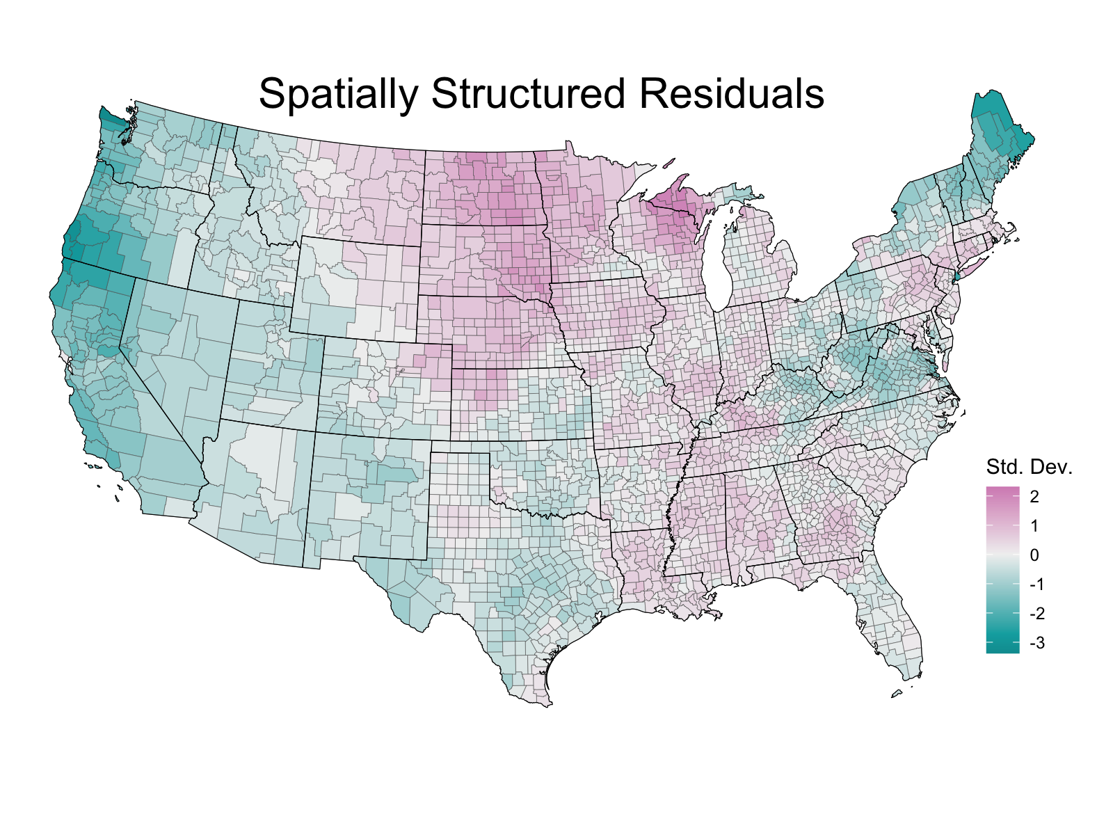
The map largely matches my intuition that that places like Wisconsin and the South have been relatively hard hit, while Maine and the rural, isolate parts of Northern California and Oregon have remained relatively unscathed.
Another way to think about a BYM model is that it adds another way for the counties within a regression to interact and “share” data between neighbors. This is similar to how a hierarchical model allows the “sharing” of data between groups. The net result is that I have several models which assume different levels of interaction between counties.
The “no-pooling” model has the lowest interaction between counties. It essentially runs 50 separate regressions, one for each state, and doesn’t allow interaction or “pooling” of data between states. The “hierarchical” or “partial-pooling” model steps up the assumed level of interactions between counties by regulating the state-level parameters. The hierarchical model works under the assumption that the state-level parameters should all be related and consistent, and this creates an interaction between all states, and subsequently, all counties. The “hierarchical BYM” model increases the level of assumed interaction between counties by also allowing each county to directly interact with its neighbors. For some states, such as New Hampshire, there are many more neighboring counties than there are counties in the actual state! This creates a high level of interaction between states, especially if they have few counties and many neighbors. Finally, the “full-pooling” model gets rid of state-level parameters entirely, and pools all the counties into a single group. This means all the counties are interacting fully in the regression, which gives small error bars, but only one nation-level parameter.
As a general rule, as the level of interaction increases, the parameter estimates for each should shrink towards each other and towards the full-pooling estimate, as well as have a reduced variance. We can see this visually with a shrinkage plot. Here, we look at the parameter estimates for the three state-level models, for all 50 states, as well as the single parameter estimate from the full-pooling model, for how the average age of a county affects COVID-19 mortality.
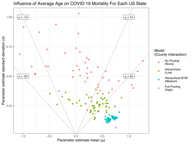
The resulting plot shows a clear shrinkage of parameter estimates towards the full-pooling value as the level of interaction increases. Taking a step back, these models have something to offer and answer slightly different questions because of their different assumptions. Here, the hierarchical BYM model captures the idea that an epidemic spreads spatially and neighbors affect each other, while also regularizing state-level coefficients to prevent odd results from small states.
An additional, powerful component of the hierarchical model is the ability to include state-level regressors. The COVID-19 response in the US became political almost immediately, and the state governors were given nearly complete control of the COVID-19 response in each state in lieu of a strong federal response. For this reason, it is likely that the political affiliation of each governor may influence the state’s ability to react to the pandemic. The plot below shows how the governor’s political affiliation effects the average of state parameters for a few chosen variables.
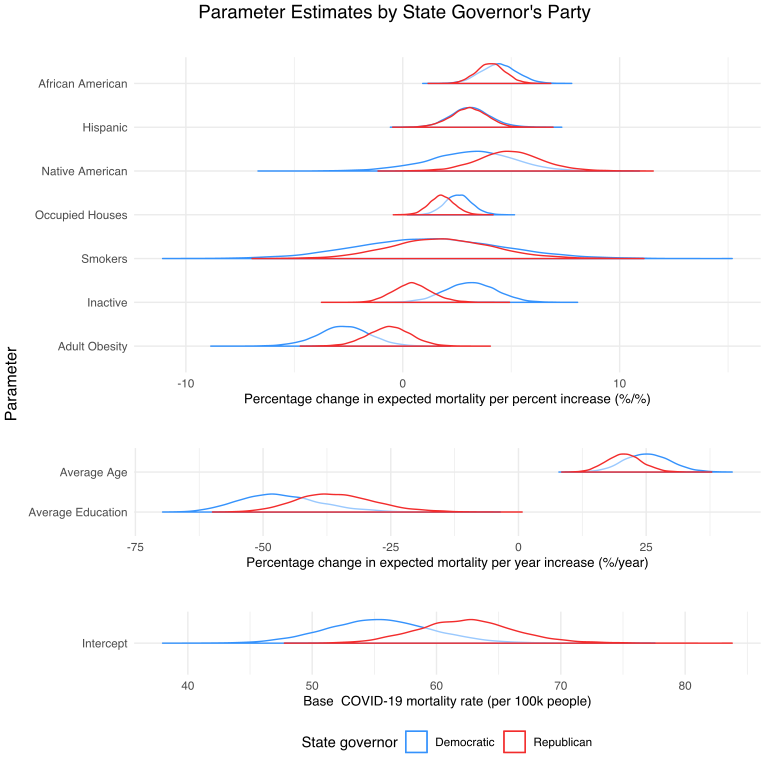
For a few parameters, notably proportion of African Americans and Hispanic Americans, the governor’s party did not change the expected effect of that parameter on COVID-19 mortality. However, Other parameters, such as proportion of inactive and obese adults show large shifts. Importantly, the intercept, or base mortality rate is very different between the two parties, with states with Republican governors seeing roughly 62 deaths per 100,000 people from March through November, and states with a democratic governor seeing roughly 55 deaths per 100,000 people.
Conclusion
We can now circle back around to the driving question of this analysis: do race and ethnicity affect COVID-19 mortality, even after controlling for other likely confounders? The answer is yes. After accounting for economic factors, geography, preexisting conditions, and other socioeconomic factors, race and ethnicity strongly affect COVID-19 mortality.
The numbers for how strong of an effect race and ethnicity have on COVID-19 mortality are most easily expressed as a percentage increase in mortality per percentage increase in number of people that identify as a particular race. For example, a one percent increase in the number of African Americans in a county roughly increases the COVID-19 mortality rate by 4%. The number for Native and Hispanic Americans are similarly high at roughly 4% and 3% respectively. This is an incredibly high rate, and shows how, even after adjusting for potential cofounders, there is an incredible racial discrepency in COVID-19 deaths. Minorities across the US are being disproportionately affected by the pandemic.
Next Steps
So far, this work has been limited to either a temporal or spatial analysis. The next step is to integrate a temporal and spatial model. Disentangling the effects of demographic variables from the temporal dynamics of a global pandemic is a complicated process, but necessary to isolate the effects of the demographics.

Jason Bossert
Data Scientist
My research interests include causal inference, Bayesian statistics, machine learning, and geospatial modeling.