COVID-19 Data Cleaning
Introduction
This blog post is dedicated to downloading and cleaning data for an exploratory analysis of COVID-19 in the United States. I will be using COVID-19 cases and deaths data from the New York Times, demographic and spatial data from the US Census Bureau, and social distancing data from the Opportunity Project.
The end goal is to have four separate tidy datasets: two that contain a unique identifier and spatial geometries for the counties and states of the US, and two that contain combined time series and demographic data for US counties and states.
Along the way, we will deal with idiosyncrasies between how different data is collected, and with a small number of missing variables. This post is going to skip over the basics of data download and cleaning, and will take a more technical approach. At the end of the day, data cleaning isn’t particularly exciting. Later posts will go much more in depth about the specific tools used and design decision that I make. If cleaning data in R is something you’d like to learn more about, Hadley Wickam’s R for Data Science is the perfect resource.
All of the code for this blogpost is available on Github.
We start by importing the libraries we will be using in R:
library(tidyverse)
library(sf)
library(spdep)
library(rjson)
library(tmap)
library(tmaptools)
library(tidycensus)
library(RCurl)
library(lubridate)
library(glmnet)
library(caret)
library(mice)
library(betareg)
library(naniar)
library(formattable)
library(openxlsx)

options(tigris_use_cache = TRUE)
work_dir <- Sys.getenv("covid_analysis_workdir")
tmp_path <- paste0(work_dir, "/data/tmp/")
Spatial Data
To get started, we are going to build the spatial part of our datasets. This is data that is stable across time, but is unique to each county or state. I am going to focus on the continental US because I am interested in how spatial effects may influence COVID-19 spread and mortality.
Census Data
Variables
The United States Census is an incredible resource for demographic and spatial data for the US. The data from the Census tends to be sparkling clean and very comprehensive. We will use the tidycensus package to easily integrate with the Census API.
The trick to working with Census data is figuring out which variables to you want to use, and what their names are. We are going to be using data from the American Community Survey 5-year summaries (ACS-5), which has a comprehensive list of available variables here. I have collected interesting variable names and some metadata in an external csv file which we can load and then use to download Census data.
census_vars_fname <- paste(work_dir, "/data/processed/census_vars.csv", sep="")
census_vars <- read_csv(census_vars_fname)
census_vars_to_get = setNames(census_vars[['acs_var_name']], census_vars[['short_name']])
census_vars
The first step to downloading anything from the Census API is to request an API key, and then to use call census_api_key with your API key. We can then move on to downloading our variables of interest. The get_acs call returns an estimate for each variable as well as a margin-of-error (moe) for each estimate. Because we are looking to perform a quicker analysis, we are going to discard the margin-of-error without looking into it. In general, the margin-of-error for variables with large counts is very small, but becomes appreciable when there are only a few people in a sampling region.
Download
We are going to download data at the county level. We will do a first pass to download the variables, and then a second and third pass to download the county and state level geometries, respectively. We are going to ignore the reported margin of error (moe) for now. This is bad practice, but I’d like to poke around in some analysis and figure out where this project is going before doing a deep dive on error analysis.
We proceed to download the county level variables:
acs_year <- 2018

county_data_path <- paste0(tmp_path, "county_data.rds")

if (file.exists(county_data_path)) {
  county_data <- readRDS(county_data_path)
} else {
  county_data <- get_acs(geography = 'county',
              variables = census_vars_to_get,
              year = acs_year) %>%
      select(-moe) %>%
      pivot_wider(names_from=variable, values_from = "estimate")
  saveRDS(county_data, county_data_path)
}

head(county_data, 10)
The returned data looks completely reasonable. All of the values are integer counts, and there is a column for every variable that I requested. We can move on to downloading the county geometries:
county_geoms <- get_acs(geography = 'county',
                    variables = 'B01001_001',
                    year = acs_year,
                    geometry = TRUE) %>%
      select(-NAME, -variable, -estimate, -moe)
county_geoms %>%
  filter(str_sub(GEOID, 1, 2) == "02") %>%
  select(GEOID) %>%
  as_tibble()
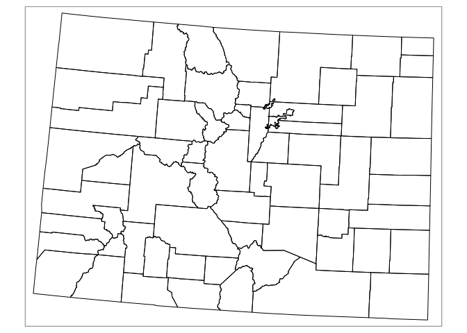
Just to make sure we have the right variables, we will go ahead and plot the counties of Colorado and verify that they look reasonable.
county_geoms %>%
  filter(substr(GEOID, start = 1, stop = 2) == "08") %>%

tm_shape(projection = 2163) +
  tm_borders(col = 'black', lwd = 1, alpha=1)
We can do the same as above for the state geometries, before finally joining the county level data to the county shapes in order to get a complete dataset for further manipulations.
county_raw <- right_join(county_geoms, county_data) %>%
  filter(str_sub(GEOID, 1, 2) != "02" & str_sub(GEOID, 1, 2) != "15")
Cleaning
Ultimately, we want to combine the Census data with the record of COVID-19 cases in the US. Interestingly, New York City does not report COVID-19 cases by county, but aggregates all 5 counties (boroughs) into one value. This is unique to NYC in the US, and requires us to aggregate the census data and geometries for NYC. First, we aggregate the values of the five counties into a new nyc value. We joined the county geometries to the variables just for this purpose.
# The geoids of the five counties of NYC
nyc_fips <- c('36005', '36081', '36061', '36085', '36047')

nyc <- county_raw[county_raw$GEOID %in% nyc_fips,] %>%
  mutate(dummy = c(1, 1, 1, 1, 1)) %>%
  subset(select = -c(GEOID, NAME)) %>%
  aggregate(by = list(d = .$dummy), FUN = sum) %>%
  select(-dummy, -d) %>%
  mutate(GEOID = '36999',
         NAME = 'New York City, New York')
We then filter out the five NYC counties, add in the new nyc row, simplify the geometries (this prevents maps from taking up an egregious amount of disk space), separate the GEOID identifier into the more granular state and county levels, and then filter the state_fips variable such that we are only working with the 50 US states and not Puerto Rico, Guam, or other US territories.
county <- county_raw %>%
  filter(!county_raw$GEOID %in% nyc_fips) %>%
  rbind(nyc) %>%
  simplify_shape(fact = 0.05) %>%
  separate(GEOID, into = c("state_fips", "county_fips"), sep=2, remove=FALSE) %>%
  filter(state_fips <= 56) %>%
  st_transform(2163)
Finally, we save the slightly-cleaned data:
county_fname <- paste(work_dir, "/data/processed/county_census_nyc_fixed.geojson", sep="")
state_fname <- paste(work_dir, "/data/processed/state_census.geojson", sep="")
st_write(county, dsn = county_fname, delete_dsn = TRUE)
st_write(state_geoms, dsn = state_fname, delete_dsn = TRUE)
If we have previously saved the census data, we can just read in the previously downloaded data.
Feature Extraction
Now that we have the census data in a nice, tidy dataframe, we need to step back and think about what variables we have, and what variables could be useful for further analysis.We need to do a bit of feature engineering.
First, we probably don’t want to compare counts. Most counts are of people or houses, which vary hugely across all the US counties. It would be much better to derive values that are population independent. To do this we can generate averages, like average age, or generate values that represent the fraction of the population in each category. Overall, there are eight categories of variables.
-
Overall sex breakdown. The overall sex variables are
pop_maleandpop_female. These values are extremely correlated, and we need to do some sort of variable transformation to uncorrelate them. To do so, we perform a reparameterization, and generate the new variablespop_male + pop_female, which ispop, andpop_male - pop_female, which we will callsex_diff. We can remove the dependence ofsex_diffon population by normalizing it to population. Variables that are normalized against the population will have a_nsuffix. -
Sex-by-age. Currently, the census reports the number of men and women in 23 age brackets. This is probably a little too much data for our uses. We can aggregate this data into a smaller number of age brackets, as well as computing an overall average age for each county. Again, the number of male and female people in each age bracket is highly correlated, so we will perform the same reparameterization and normalization as with the overall sex numbers.
-
Race and ethnicity. We will normalize these to the population.
-
Educational attainment. Similarly to the age by gender variables, we have far more categories in educational attainment than we can make use of. We are going to start by assigning a number of years of education to each education level and computing a mean number of years of education as well as a difference.
-
Family variables. Family variables will be normalized to the total number of families, indicated by an appended
_f. The total number of families will be normalized to the population. -
House variables. House variables will be normalized to the total number of houses, indicated by an appended
_h. The total number of houses will be normalized to the population. -
Income. We will only calculate an average income for each county. This calculation might be troublesome, as there is an unbounded upper for incomes that may skew any distribution far to the right.
-
House value. Similarly to the income, we will only calculate an average house value for each county, and there may be skewness that increases the error of this calculation.
The following calculations assign quantitative values to the qualitative variables that we would like to make summaries of.
median_age <- c(2.5, 7.5, 12.5, 16.5, 19, 20.5, 21.5, 23.5,
               27.5, 32.5, 37.5, 42.5, 47.5, 52.5, 57.5, 61,
               63.5, 66, 68.5, 72.5, 77.5, 82.5, 90)

years_edu <- c(0, 2.5, 5.5, 7.5, 9, 10, 11, 12, 12, 13, 14, 14, 16, 18, 20, 22)

median_income <- census_vars %>%
  filter(sub_category == 'income') %>%
  select(., c(lower, upper)) %>%
  mutate(across(everything(), as.numeric)) %>%
  transmute(mean = rowSums(.) / 2) %>%
  as.list()

median_house_val <- census_vars %>%
  filter(sub_category == 'value') %>%
  select(., c(lower, upper)) %>%
  mutate(across(everything(), as.numeric)) %>%
  transmute(mean = rowSums(.) / 2) %>%
  as.list()
Finally, we can go ahead and process all the columns to create a new, smaller, more feature-rich dataframe.
county_features <- county %>%
  st_set_geometry(NULL) %>%
  separate(NAME, c("county", "state"), ",", remove=FALSE) %>%
  transmute(
    geoid = GEOID,
    state_fips = state_fips,
    county_fips = county_fips,
    county = county,
    state = state,
    name = NAME,
    pop = pop,
    log_pop = log2(pop),
    sex_diff = pop_male - pop_female,
    sex_diff_n = sex_diff / pop,

    sa_tot_0_17_n = (rowSums(select(., c(sa_m_1:sa_m_4, sa_f_1:sa_f_4)))) / pop,
    sa_tot_18_24_n = (rowSums(select(., c(sa_m_5:sa_m_8, sa_f_5:sa_f_8)))) / pop,
    sa_tot_25_39_n = (rowSums(select(., c(sa_m_9:sa_m_11, sa_f_9:sa_f_11)))) / pop,
    sa_tot_40_59_n = (rowSums(select(., c(sa_m_12:sa_m_15, sa_f_12:sa_f_15)))) / pop,
    sa_tot_60_up_n = (rowSums(select(., c(sa_m_16:sa_m_23, sa_f_16:sa_f_23)))) / pop,
    sa_diff_0_18_n = (rowSums(select(., sa_m_1:sa_m_4)) - rowSums(select(., sa_f_1:sa_f_4))) / pop,
    sa_diff_19_24_n = (rowSums(select(., sa_m_5:sa_m_8)) - rowSums(select(., sa_f_5:sa_f_8)) / pop),
    sa_diff_25_39_n = (rowSums(select(., sa_m_9:sa_m_11)) - rowSums(select(., sa_f_9:sa_f_11))) / pop,
    sa_diff_40_59_n = (rowSums(select(., sa_m_12:sa_m_15)) - rowSums(select(., sa_f_12:sa_f_15))) / pop,
    sa_diff_60_up_n = (rowSums(select(., sa_m_16:sa_m_23)) - rowSums(select(., sa_f_16:sa_f_23))) / pop,

    avg_age_male = rowSums(sweep(select(., sa_m_1:sa_m_23), 2, median_age, "*")) / pop_male,
    avg_age_female = rowSums(sweep(select(., sa_f_1:sa_f_23), 2, median_age, "*")) / pop_female,
    avg_age = (avg_age_male*pop_male + avg_age_female*pop_female) / pop,
    avg_age_diff = avg_age_male - avg_age_female,

    race_white_n = race_white / pop,
    race_aa_n = race_aa / pop,
    race_aian_n = race_aian / pop,
    race_asian_n = race_asian / pop,
    race_nhopi_n = race_nhopi / pop,
    race_other_n = race_other / pop,
    race_two_n = race_two / pop,
    race_hisp_n = race_hispanic / pop,

    avg_edu_male = rowSums(sweep(select(., schl_m_1:schl_m_16), 2, years_edu, "*")) / pop_male,
    avg_edu_female = rowSums(sweep(select(., schl_f_1:schl_f_16), 2, years_edu, "*")) / pop_female,
    avg_edu = (avg_edu_male*pop_male + avg_edu_female*pop_female) / pop,
    avg_edu_diff = avg_edu_male - avg_edu_female,

    fam_total = family_total,
    fam_total_n = fam_total / pop,
    fam_married_f = family_married / fam_total,
    fam_other_f = family_other / fam_total,
    fam_nonfam_f = family_nonfamily / fam_total,

    hs_total = houses_total,
    hs_total_n = hs_total / pop,
    hs_occ_h = houses_occupied / hs_total,
    hs_vac_h = houses_vacant / hs_total,
    hs_owner_h = houses_owner / hs_total,
    hs_rent_h = houses_renter / hs_total,

    inc_total = rowSums(select(., starts_with('inc'))),
    inc_avg = rowSums(sweep(select(., starts_with('inc')), 2, median_income$mean, "*")) / inc_total,

    hval_total = rowSums(select(., starts_with('hval'))),
    hval_avg = rowSums(sweep(select(., starts_with('hval')), 2, median_house_val$mean, "*")) / hval_total,
    ) %>%
  select(-inc_total)

head(county_features, 100)
Having fixed the NYC merge issue, we can separate a new county_geometry dataset for future use.
county_geometry <- county %>%
  select(c(GEOID, state_fips, county_fips)) %>%
  rename(geoid = GEOID)
Exploration
This first thing we will look at is how complete the data set is. The Census is generally a remarkable clean source for data, but we cant be sure.
head(miss_var_summary(county_features), 50)
county_features[rowSums(is.na(county_features)) > 0, c('geoid', 'state', 'county')]
Indeed, we find that there is one county where income data is missing, Rio Arriba County, New Mexico. There is no particular reason to believe that there is anything different about Rio Arriba County that has prevented income data to be collected. Since there is only one county where we are missing a small set of data, we will use a linear regression to estimate the average income of this county.
rio_arriba_geoid = "35039"

y <- county_features %>%
  filter(geoid != rio_arriba_geoid) %>%
  select(inc_avg) %>%
  as.matrix()

x <- county_features %>%
  select(geoid, log_pop, avg_age, avg_age_diff, starts_with("race_"),
         avg_edu, starts_with("fam"), starts_with("hs"),
         starts_with("hval"))

x_train <- x %>%
  filter(geoid != rio_arriba_geoid) %>%
  select(-geoid) %>%
  as.matrix()

x_pred <- x %>%
  filter(geoid == rio_arriba_geoid) %>%
  select(-geoid) %>%
  as.matrix()
fit = glmnet(x_train, y, family="gaussian")
cvfit = cv.glmnet(x_train, y)
rio_arriba_inc_pred = predict(cvfit, newx = x_pred, s = "lambda.min")

county_features <- county_features %>%
  mutate(inc_avg = replace(inc_avg, geoid == rio_arriba_geoid, rio_arriba_inc_pred))
Summary
Having finished cleaning the dataset, the next step is to look at the summary statistics of the dataset to make sure that none of the variables that we have created are displaying strange behavior.
summary <- county_features %>%
  select(-c(geoid, state_fips, county_fips, county, state, name)) %>%
  summarize(across(everything(), c(min, median, mean, max, sd, IQR))) %>%
  tibble::rownames_to_column() %>%
  pivot_longer(-rowname) %>%
  pivot_wider(names_from=rowname, values_from=value) %>%
  separate(name, into=c("var", "summary_func"), sep = -2) %>%
  mutate(summary_func = sub("_", "", summary_func)) %>%
  pivot_wider(names_from = summary_func, values_from = `1`) %>%
  rename(c("min"="1", "median"="2", "mean"="3", "max"="4", "sd"="5", "IQR"="6"))

options(scipen=999)
options(digits=2)
head(summary, 44)
options(scipen=0)
Looking at these summary statistics gives us a little insight into the data. First, we can find variables that don;t appear to be normally distributed by comparing the mean and median, and the sd and the interquartile range. We see that while population is not normally distributed, the logarithm of population is. We also see that normalizing population variables by the total population to make them fractional leaves them looking fairly normal.
Interestingly, there is a county with only ~1% of its population in the 18-24 bracket, and another county with 65% of its people over the age of 60. Average for the US counties range from 27 to 60, which is a larger range than I would have guessed, but small counties with a rather homogeneous population can lead to odd averages.
On average, women are better educated than men.
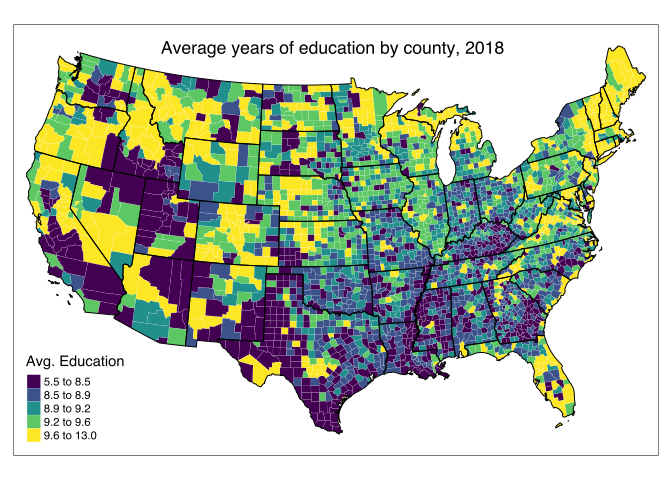
Overall, nothing stands out as being odd, so we can move forward with plotting some of the variables to visualize what we are working with!
Because we don’t want to carry around the geometry column for all analyses, we will need to join the data with the geometry anytime we create a thematic map.
var = 'avg_edu'

plot_data = right_join(county_geometry, county_features, by = 'geoid')

cuts = signif(quantile(plot_data[[var]], probs = seq(0, 1, length.out = 6)), 2)

state_lines = tm_shape(state_geoms, projection = 2163) +
  tm_borders(col = 'black', lwd = 1, alpha=1)

tm_shape(plot_data, projection = 2163) +
  tm_fill(var,
    breaks = cuts,
    pallette = "seq",
    title = "Avg. Education") +
  tm_borders(col = 'white', lwd = .2, alpha = .5) +
  tm_layout(title = "Average years of education by county, 2018",
            title.size = 1.1,
            title.position = c("center", "top"),
            aes.palette = list(seq = "viridis"),
            inner.margins = c(0.05, 0.02, 0.05, 0.02)) +
  state_lines
Political Leanings
Unfortunately, the COVID-19 response in the United States has become a highly politicized topic. This means that it isn’t unreasonable to expect political affiliation to be predictive of COVID-19 infectivity or recovery rates. I will use the results of the 202 election as a proxy for the political leanings of each county. In order to simplify the data, I will only look at the relative vote difference between the two major major parties.
There are a number of repositories on Github that have election results. We can download the data using R’s getURL function, and then do basic formatting of the resulting data table.
pol_url <- getURL("https://raw.githubusercontent.com/tonmcg/US_County_Level_Election_Results_08-20/master/2020_US_County_Level_Presidential_Results.csv")

pol_raw <- read.csv(text = pol_url) %>%
  mutate(geoid = sprintf("%05s", county_fips)) %>%
  separate(geoid, into = c("state_fips", "county_fips"), sep=2, remove=FALSE) %>%
  filter(state_fips != "02" & state_fips != "15") %>%
  rename(gop = votes_gop, dem = votes_dem) %>%
  pivot_longer(c(gop, dem), names_to = "party", values_to = "votes") %>%
  select(geoid, state_fips, county_fips, party, votes, total_votes)
Once again, we need to combine the five counties of NYC into a single county. I then create a new column from the total vote numbers for each candidate that is the difference in votes divided by the total number of votes. The new variable pct_dem is the percentage swing that each county had towards the Democratic candidate. This is a convenient variable, as it encodes a lot of information with only a single variable.
merge_NYC_counties <- function(data) {

  nyc_fips <- c('36005', '36081', '36061', '36085', '36047')

  nyc <- data[data$geoid %in% nyc_fips, ] %>%
  subset(select = -c(geoid, state_fips, county_fips)) %>%
  group_by(party) %>%
  summarise_all(sum) %>%
  mutate(geoid = '36999',
           state_fips = '36',
           county_fips = "999")

  new_data <- data %>%
    filter(!data$geoid %in% nyc_fips) %>%
    rbind(nyc)

  return(new_data)
}

pol <- merge_NYC_counties(pol_raw) %>%
  pivot_wider(names_from = party, values_from = votes) %>%
  mutate(pct_dem = (dem-gop)/total_votes) %>%
  select(-c(total_votes, dem, gop)) %>%
  arrange(geoid)
The final step is to create a map of voter preference, and make sure that it matches our expectations!
right_join(county_geometry, pol, by = 'geoid') %>%
  tm_shape(projection = 2163) +
  tm_fill(col = "pct_dem",
    palette = "RdBu",
    title = "Democratic lean") +
  tm_borders(col = 'white', lwd = .2, alpha = .5) +
  tm_layout(title = "Ratio Democratic lean by county, 2020 Presidential election",
            title.size = 1.1,
            title.position = c("center", "top"),
            inner.margins = c(0.02, 0.02, 0.07, 0.02)) +
  state_lines
Warning: The shape . contains empty units.
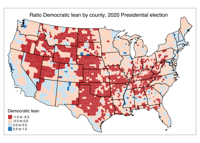
We see that there is a large, deeply conservative core of the country, with liberal pockets along the coasts and in other large metropolitan areas.
Co-morbidity
We are going to look at a few co-morbidity factors in order to control for these likely-important correlates. We can look at data from (https://www.countyhealthrankings.org)[https://www.countyhealthrankings.org] to get an idea for where each county stands with respect to obesity, smoking, mental health, drinking, health insurance, and other variables.
filename <- paste0(work_dir, "/data/raw/2020_County_Health_Rankings_Data_v2.xlsx")
county_health_rankings_raw <- read.xlsx(filename, sheet = 4, startRow = 2) %>%
  select(c(FIPS, State, County, `%.Fair.or.Poor.Health`,
                Average.Number.of.Physically.Unhealthy.Days,
                Average.Number.of.Mentally.Unhealthy.Days,
                `%.Smokers`, `%.Adults.with.Obesity`, `%.Physically.Inactive`,
                `%.Excessive.Drinking`, `%.Uninsured`, `%.Vaccinated`))

vars <- c("geoid", "state", "county", "poor_health", "phys_unhealthy_days",
          "mental_unhealthy_days", "smokers", "adult_obesity", "inactive",
          "drinking", "uninsured", "flu_vacc")
colnames(county_health_rankings_raw) <- vars
After loading the initial dataset, we’ll transform some of the percent variables into proportions, as the zero to one scale of a proportion is much better suited to modelling than a percent. We’ll also impute missing values with the mean of that value across all counties. There is very little missing data, so this should not influence any inferences down the line.
percent_conv <- vars[c(4, 7, 8, 9, 10, 11, 12)]
county_health_rankings_raw <- county_health_rankings_raw %>%
  mutate(across(all_of(percent_conv), function(x) x/100)) %>%
  drop_na(county)

impute_mean <- function(x) replace(x, is.na(x), mean(x, na.rm = TRUE))

county_health_rankings <- left_join(pol, select(county_health_rankings_raw, -c("state", "county")), by="geoid") %>%
  group_by(state_fips) %>%
  mutate(across(all_of(vars[4:length(vars)]), impute_mean)) %>%
  ungroup()
Hypertension has also been identified as a potentially important comorbidity. We can get hypertension data from the (IMHE)[http://ghdx.healthdata.org/record/ihme-data/united-states-hypertension-estimates-county-2001-2009] study.
options(digits = 9)

filename <- paste0(work_dir, "/data/raw/IHME_USA_HYPERTENSION_BY_COUNTY_2001_2009.CSV")
county_hypertension_raw <- read.csv(filename, na.strings=c("")) %>%
  drop_na(County) %>%
  filter(Race == "all") %>%
  select(c(FIPS, State, County, `Total..Male..2009`, `Total..Female..2009`)) %>%
  rename(geoid = FIPS, state = State, county = County, male_hypertension = `Total..Male..2009`,
         female_hypertension = `Total..Female..2009`) %>%
  separate(male_hypertension, into = c("male_hypertension", NA), sep = -1) %>%
  separate(female_hypertension, into = c("female_hypertension", NA), sep = -1) %>%
  mutate(across(all_of(c("male_hypertension", "female_hypertension")),
                function(x) as.numeric(x)/100)) %>%
  mutate(geoid = sprintf("%05d", geoid))

county_health <- left_join(county_health_rankings, select(county_hypertension_raw, -c("state", "county")), by="geoid") %>%
  group_by(state_fips) %>%
  mutate(across(all_of(c("male_hypertension", "female_hypertension")), impute_mean)) %>%
  ungroup()
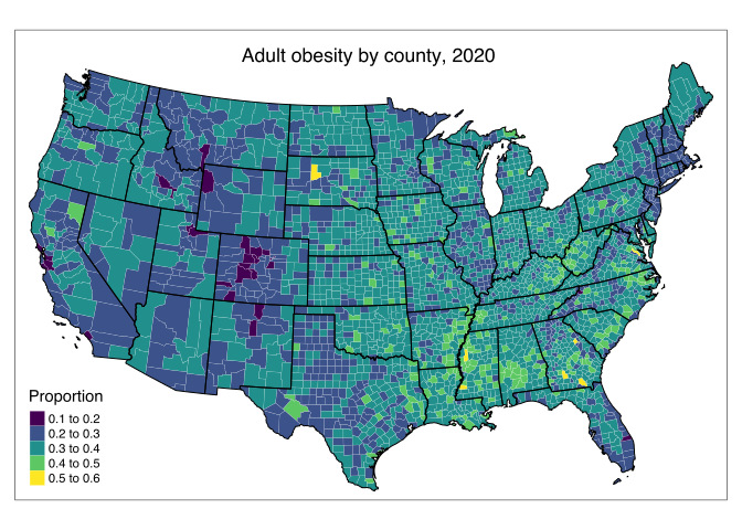
And finally, we can plot the obesity by county:
right_join(county_geometry, county_health, by = 'geoid') %>%

tm_shape(projection = 2163) +
  tm_fill(col = "adult_obesity",
    palette = "viridis",
    title = "Proportion",
    n = 4) +
  tm_borders(col = 'white', lwd = .2, alpha = .5) +
  tm_layout(title = "Adult obesity by county, 2020",
            title.size = 1.1,
            title.position = c("center", "top"),
            inner.margins = c(0.02, 0.02, 0.07, 0.02)) +
  state_lines
Warning: The shape . contains empty units.
Timeseries Data
So far we have only looked at spatial data that doesn’t have anything that changes over time (at least on the scales we are concerned about). However, the goal of this larger project is to try and understand the variables that affect how COVID-19 has spread in the US. The idea of “spread” in this context has an inherent time component, and so I will need to find some timeseries data that I think could explain how COVID-19 has affected the US.
New York Times COVID-19 Data
What better place to start when modelling COVID-19 than by downloading some COVID-19 data? Johns Hopkins and the New York Times (NYT) have both kept excellent track of cases and death in all the US counties. For this analysis, I will be using the NYT data. We start by downloading the NYT data, and doing some basic cleaning so that some of the identification variables like geoid match our previous definitions of these variables.
nyt_covid_url <- getURL("https://raw.githubusercontent.com/nytimes/covid-19-data/master/us-counties.csv")
covid_raw <- read.csv(text = nyt_covid_url) %>%
  mutate(geoid = sprintf("%05d", fips),
         geoid = replace(geoid, county == 'New York City', 36999),
         date = ymd(date)) %>%
  filter(date < ymd("20201231")) %>%
  filter(str_sub(geoid, 1, 2) != "02" & str_sub(geoid, 1, 2) != "15") %>%
  drop_na(fips) %>%
  select(-fips)

head(covid_raw, 50)
The NYT COVID Dataset has counts for independent cities in Virginia which we have no geometries for. These cities are small, and will make our analysis challenging without matching geometries. Therefore, we will drop the small cities from the covid dataset. There are also counties in the census data that have not yet had a COVID case. We will add these counties with zero values for deaths and cases to the covid data set. This will make the covid dataset and the census datasets align.
no_covid_counties <- county_features %>%
  filter(!geoid %in% covid_raw$geoid) %>%
  select(county, state, geoid) %>%
  mutate(date = covid_raw$date[[1]],
         cases = 0L,
         deaths = 0L,
         county = str_remove(county, "County"))
In order to produce a clean dataset, I would like for every county to have a value for cases and deaths for every day of the analysis. However, the NYT dataset only starts recording counties once they have seen their first cases. In order to get data for every day for every county, we can pivot the table wide so that every day is its own column. This forces days that don’t have any record for certain days to have a NA. I’ll then replace all the NAs with 0 to indicate that these counties just haven’t had any cases yet.
This wide form of data doesn’t play nice with the rest of R’s tidyverse, so we then pivot the table long. Finally, the counts that the NYT reports for cases and deaths are total counts. We would also like to perform analysis on daily totals, so we generate those columns as well, and suffix them with _d to represent the daily totals.
covid <- covid_raw %>%
  rbind(no_covid_counties) %>%
  distinct() %>%
  pivot_wider(names_from = date, values_from = c(cases, deaths)) %>%
  replace(is.na(.), 0) %>%
  pivot_longer(-c(county, state, geoid), names_to = c(".value", "date"), names_pattern = "(.+)_(.+)") %>%
  group_by(geoid) %>%
  mutate(cases_d = cases - lag(cases),
         deaths_d = deaths - lag(deaths),
         cases_d = if_else(cases_d < 0, 0L, cases_d, missing = 0L),
         deaths_d = if_else(deaths_d < 0, 0L, deaths_d, missing = 0L)) %>%
  arrange(geoid) %>%
  mutate(date = ymd(date))
Now we have a clean, daily covid dataset. Because the counts for cases and especially for deaths are not particularly high for many counties, we are also going to aggregate the daily count data to weekly count data.
covid_week <- covid %>%
  group_by(geoid, year = year(date), week = week(date)) %>%
  summarise(cases_w=sum(cases_d),
            deaths_w=sum(deaths_d),
            cases=last(cases),
            deaths=last(deaths)) %>%
  ungroup() %>%
  replace(is.na(.), 0)
head(filter(covid_week, geoid == "17031"), 50)
joint_data <- left_join(county_health, covid, by="geoid") %>%
  arrange(geoid)
For completeness sake, we can look at how the cases across the US look at any given day or week. We will look for week number 28, which is July 6 through July 12.
plot_data = right_join(county_geometry,
                      filter(joint_data,
                             date == ymd("20200930")),
                             by = 'geoid')

var = 'cases_d'
tmp_base = 4
cuts = c(0, signif(tmp_base^(0: log(ceiling(max(plot_data[[var]])), base = tmp_base) + 1), 4))

tm_shape(plot_data, projection = 2163) +
  tm_fill(var,
    breaks = cuts,
    pallette = "seq",
    title = "Cases") +
  tm_borders(col = 'white', lwd = .2, alpha = .5) +
  tm_layout(aes.palette = list(seq = "viridis"),
            title = "Daily COVID-19 cases by county, September 30, 2020",
            title.size = 1.1,
            title.position = c("center", "top"),
            inner.margins = c(0.05, 0.02, 0.07, 0.02)) +
  state_lines
Warning: The shape plot_data contains empty units.
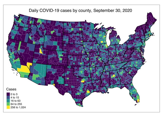
This highlights the huge rise in cases that we have seen over the last couple weeks in metro areas across the south, and really across the south in general. We will dive into looking at maps of COVID-19 cases much more in the next blog post.
Social Distancing and Economic Data
An important factor governing the spread of COVID-19 is how well people are following social distancing guidelines. This is hard to measure, but the Opportunity Lab has many timeseries datasets that may correlate with social distancing. Many of these datasets measure economic activity in some form or another, except for the Google GPS dataset, which measures where people have been spending their time.
County-Level Data
The Opportunity Lab datasets come in county, state, and national geometries. As the rest of the data I have collected so far is at the county-level, I will first look into the county level Opportunity Lab datasets. I will be focusing on two different datasets. We will download these datasets in the same way as all previous data that has been hosted on Github.
- Affinity Consumer spending. Consumer spending data across a number of categories.
- Google GPS. Google mobility data, which looks at where people have been spending time.
affinity_consumer_spend_url_county <- getURL("https://raw.githubusercontent.com/OpportunityInsights/EconomicTracker/main/data/Affinity%20-%20County%20-%20Daily.csv")

google_gps_url_county <- getURL("https://raw.githubusercontent.com/OpportunityInsights/EconomicTracker/main/data/Google%20Mobility%20-%20County%20-%20Daily.csv")
Data form the Opportunity lab is all in the same format, but it isn’t quite the format that matches the other data I have prepared. I wrote a small function to read in the data and perform a little formatting, which we can use on all five datasets.
read_OpportunityLab_dataset <- function(raw_text, var_start, y_name = "year", m_name = "month", d_name = "day") {
  read.csv(text = raw_text) %>%
    mutate(across(starts_with(var_start), ~ifelse(.x == ".", NA, .x)),
           across(starts_with(var_start), as.numeric),
           geoid = sprintf("%05d", countyfips),
           date = ymd(sprintf('%04d%02d%02d', .[[y_name]], .[[m_name]], .[[d_name]]))) %>%
    select(geoid, date, starts_with(var_start))
}

affinity_raw_county <- read_OpportunityLab_dataset(affinity_consumer_spend_url_county, "spend", d_name = "day")
google_raw_county <- read_OpportunityLab_dataset(google_gps_url_county, "gps")
The first step is to look at what data might be missing. Just from looking at the raw csv on Github, I suspect that there is a significant amount of missing data. I’ll start by looking at the Google GPS data, as I think it has the most predictive potential for future analysis. We’ll look at missing data by creating an upset plot using the naniar package. Upset plots are a way to visualize different grouping of data, first presented in this Nature paper, with more description here. We will use this upset plot to look at how missingness is correlated between different variables.
strip_header_space <- function(x, header) {
  x %>%
    str_remove(header) %>%
    str_replace_all("_", " ")
}

google_raw_county %>%
  rename_with(function(x) strip_header_space(x, "gps_"), starts_with("gps_")) %>%
  gg_miss_upset(nsets = 10, nintersects = 20, show.numbers = T,
                att.pos = "bottom", point.size = 4, line.size = 1,
                text.scale = 1.3, mb.ratio = c(0.5, 0.5))
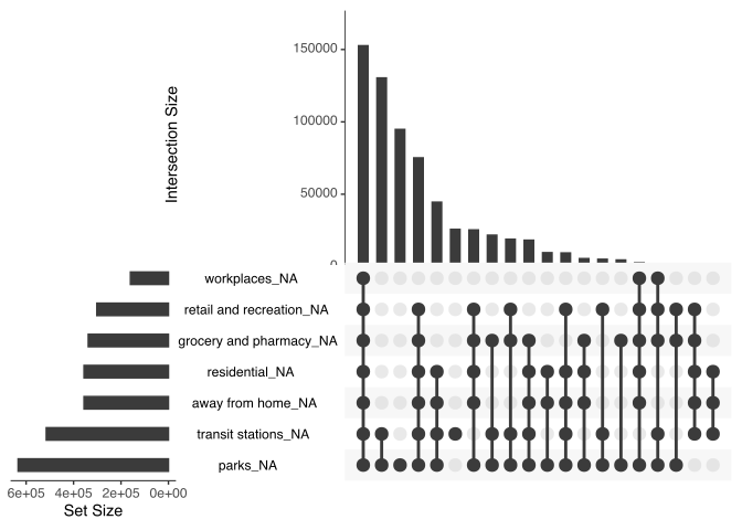
The results aren’t great. To interpret this upset plot we will start with the matrix of dots and lines in the center. This shows the grouping of variables that is plotted by the top bar chart. For example, the first column shows that the largest grouping of missing variables is counties that are missing transit_stations, resedential, away_from_home, and parks values. There are more than 60,000 entries that are missing these four variables together. The next column shows that there are also roughly 60,000 entries that are missing all variables. The horizontal bar plot on the left of the dot matrix shows how many values are missing from each variable. We see that a huge number of values are missing from most of the variables. This really shows that this data set may be hard to use for any analysis that requires a complete and tidy dataset.
Another way to look at the missingness of data is to try and determine if the data is missing completely at random (MCAR) or missing not at random (MNAR). MCAR data can be easier to work with, as the randomness of the missing variables means we can use more standard imputation techniques. MNAR data is challenging to impute, as we have to model the reason the data is missing. In summary, we can think of data missing at random as data points that have independently and randomly been selected to disappear. This means all of the assumptions of statistical modelling hold, and we can model the missing data. If the missing data is not missing at random, then there are confounding effect that we have to account for.
I have a hunch that the reason there is a lot of missing data for counties is that some counties have so few people in them that this type of data can’t be collected and reported in a randomized way. We can check this hunch by plotting the missingness of data versus population for the counties. for several of the variables. Remember, these variables are timeseries, so every county has many points. Some counties may have no data, or only have data after a certain point in time.
vars = c("gps_retail_and_recreation", "gps_workplaces", "gps_parks", "gps_away_from_home")

google_raw_county %>%
  group_by(geoid) %>%
  summarise(across(starts_with("gps"), ~sum(is.na(.x)))) %>%
  left_join(select(county_features, c(geoid, pop))) %>%
  drop_na() %>%
  pivot_longer(cols = starts_with("gps"), names_to = "variable", values_to = "value") %>%
  filter(variable %in% vars) %>%

  ggplot(aes(x = log10(pop), y = value, color = variable)) +
    geom_point(alpha = 0.2) +
    labs(x = "Log population (base 10)",
         y = "Number of missing values",
         title = "Correlation between missingness and population") +
    theme(legend.position="bottom", legend.box = "horizontal") +
    guides(colour = guide_legend(override.aes = list(alpha = 1)))
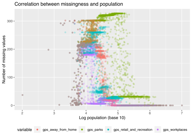
The county-level data has many missing values, and these values are not missing at random. Instead, counties with large population are well represented in the data, while less populous counties are largely missing. Trying to use this data or impute so much of the data will likely lead to inaccurate conclusions for rural and less populous areas. While we have only looked at the Google GPS data, the story is similar for the other datasets.
One option is to model urban and rural areas separately, using the additional data for urban areas. The merits of this approach is that urban areas have the largest share of the population and are focal points for disease spread. The downsides are that we have to build and couple two models. An alternative is to use state-level data for the timeseries, as the state-level data is relatively complete, and construct a hierarchical model.
State-Level Data
We repeat the download process, and then process the data with a slightly modified function for the slightly different format of state vs. county data.
affinity_consumer_spend_url_state <- getURL("https://raw.githubusercontent.com/OpportunityInsights/EconomicTracker/main/data/Affinity%20-%20State%20-%20Daily.csv")

google_gps_url_state <- getURL("https://raw.githubusercontent.com/OpportunityInsights/EconomicTracker/main/data/Google%20Mobility%20-%20State%20-%20Daily.csv")
When reading in the Affinity data, we add one day to the date so that it aligns with our definition of weekly data for the COVID-19 dataset.
read_OpportunityLab_dataset2 <- function(raw_text, var_start, y_name = "year", m_name = "month", d_name = "day") {
  read.csv(text = raw_text) %>%
    mutate(statefips = sprintf("%02d", statefips),
           across(starts_with(var_start), ~ifelse(.x == ".", NA, .x)),
           across(starts_with(var_start), as.numeric),
           date = ymd(sprintf('%04d%02d%02d', .[[y_name]], .[[m_name]], .[[d_name]]))) %>%
    select(statefips, date, starts_with(var_start))
}

affinity_raw_state <- read_OpportunityLab_dataset2(affinity_consumer_spend_url_state, "spend", d_name = "day")
google_raw_state <- read_OpportunityLab_dataset2(google_gps_url_state, "gps") %>%
  filter(date >= ymd("2020-01-08"))
Missing Data
Similarly to the county level data, the next step is to figure out what the missing data looks like. The Google dataset doesn’t start until late February and the Affinity data only goes until the end of November, so we will filter our data to lie between those two times.
all_state <- affinity_raw_state %>%
  full_join(google_raw_state) %>%
  filter(date > ymd("20200301") & date < ymd("20201130"))
Joining, by = c("statefips", "date")
all_state %>%
  gg_miss_upset(nsets = 10, nintersects = 20, show.numbers = T,
                att.pos = "bottom", point.size = 4, line.size = 1,
                text.scale = 1.3, mb.ratio = c(0.5, 0.5))
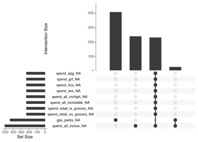
We see that there are three variables that have missing data. These variables don’t encode a whole lot of information that the other variables lack, so we will go ahead and filter them out.
time_covariates <- all_state %>%
  select(-c(gps_transit_stations, gps_parks, spend_all_inclow))
Final saves
Finally, we can save our data!
county_geometry_fname <- paste(work_dir, "/data/processed/county_geometry.geojson", sep="")
state_geometry_fname <- paste(work_dir, "/data/processed/state_geometry.geojson", sep="")
county_data_fname <- paste(work_dir, "/data/processed/county_data.csv", sep="")
state_data_fname <- paste(work_dir, "/data/processed/state_data.csv", sep="")

st_write(county_geometry, county_geometry_fname, delete_dsn = TRUE)
st_write(state_geoms, state_geometry_fname, delete_dsn = TRUE)

write_csv(joint_data, county_data_fname)
write_csv(time_covariates, state_data_fname)
Conclusion
In this post I accumulated data from four different sources and imputed missing values for some columns and dropped other columns that had too many missing values to impute. Our final product is a set of clean datasets that will enable us to easily build models for future analysis.

Jason Bossert
Data Scientist
My research interests include causal inference, Bayesian statistics, machine learning, and geospatial modeling.